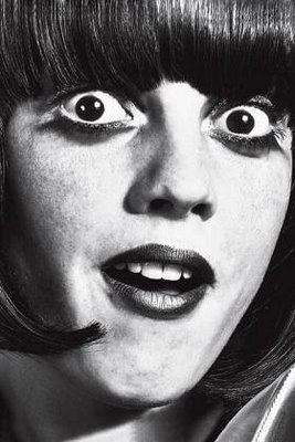
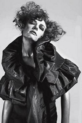
Firstly, there are the Moschino ads. Def not my favourite ads, (perhaps I'm just too dense to get the message and theme of the ads.) Don't these ads look like pencil sketches to you? At least they do to me, especially the second one.
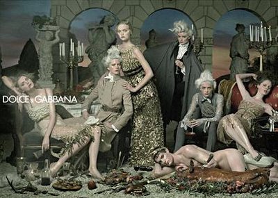
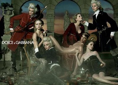
Secondly, there are the Dolce & Gabbana ads. Again, they're not my favourite ads this season, (the SS06 Dolce ads were waay prettier), but I certainly stared at them the longest of all the FW06 ads. Because if you look at all the images in one go on the Dolce website, you feel sort of like you're walking in a museum, looking at a set of paintings. All the (female) models are wearing gorgeous dresses, and some look rather... dead in the images.
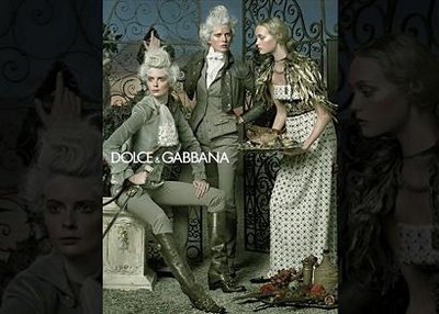
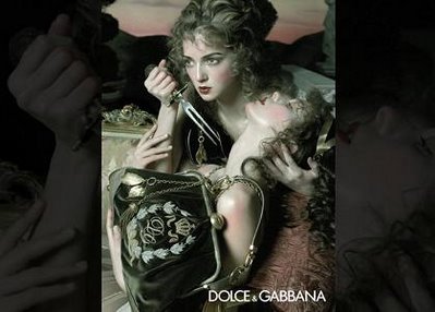 This girl is probably thinking, 'At least I'm going to die with my beloved Dolce & Gabbana handbag.'
 Personally, I prefer advertisements to be clear and focused photographs. But it's always interesting to have variety. Do you like this kind of ads?
And yes, I do realise all these ads are actually photophraghs.


No comments:
Post a Comment